Product design · Flyway Desktop · 2025
Reducing drop-off at the launch page
A hidden option and one ambiguous word were sending people the wrong way before they’d even started. Two visible buttons and a clearer label took drop-off from 20.7% to 16.1%.
- drop-off before
- 20.7%
- drop-off after
- 16.1%
- improvement
- −4.6pp
- Company
- Redgate
- Product
- Flyway Desktop
- My role
- UX designTelemetry analysisUX copy
- Methods
- Funnel telemetry · Hypothesis-led design · Minimal-change experiment · Copywriting
OutcomeLaunch page drop-off fell from 20.7% to 16.1% for hybrid Enterprise projects, tracked across multiple versions since v8.3.6 shipped in July 2025.
Full story: showing every section.
Context
The product and the moment
Flyway Desktop is a database change management tool used by development and DBA teams to track, version and deploy schema changes. The project setup flow is the gateway to everything the tool does. Without completing it, you can’t track database changes or generate migration scripts. Setup isn’t optional; it’s the threshold between someone who has installed the tool and someone who is actually using it.
In early 2025, telemetry showed that a significant proportion of people were abandoning setup before crossing that threshold. Two distinct drop-off points were visible in the data. This is the first of them. (The second, and larger, is the Schema Model wizard.)
Problem
A hidden option causing wrong turns
20.7% of users who clicked “New Project” abandoned the setup mid-flow. The data told us where they left, but not why. Looking at the design, a hypothesis formed quickly: a lot of these people probably didn’t want to create a new project at all. They wanted to open an existing one, from a local file or a Git repository. But that option was buried inside a split-button dropdown, labelled “Open from version control”, which not everyone recognises as meaning Git. The most visible path was “New project”, and when people realised it wasn’t what they needed, they left.
Evidence
Where, but not why
Drop-off data flagged the launch page, and we set the 20.7% abandonment rate as our baseline for new hybrid Enterprise projects. That was the extent of what telemetry could give us.
The rest was design judgement. The hidden split button and the vague “version control” label pointed to a discoverability failure, not a deeper architectural UX problem. That mattered, because it meant the fix could be small.
The change
Explicit over hidden
The fix was deliberately minimal. Rather than redesigning the whole launch screen, we made two targeted changes: replace the split button with two clearly labelled standalone buttons, and rename “Open project” to “Open existing project”, removing any ambiguity about whether this option creates something new or opens something that already exists. Small surface, high leverage.
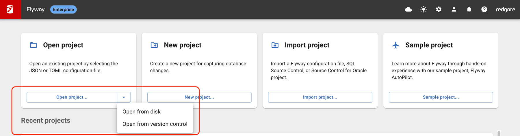
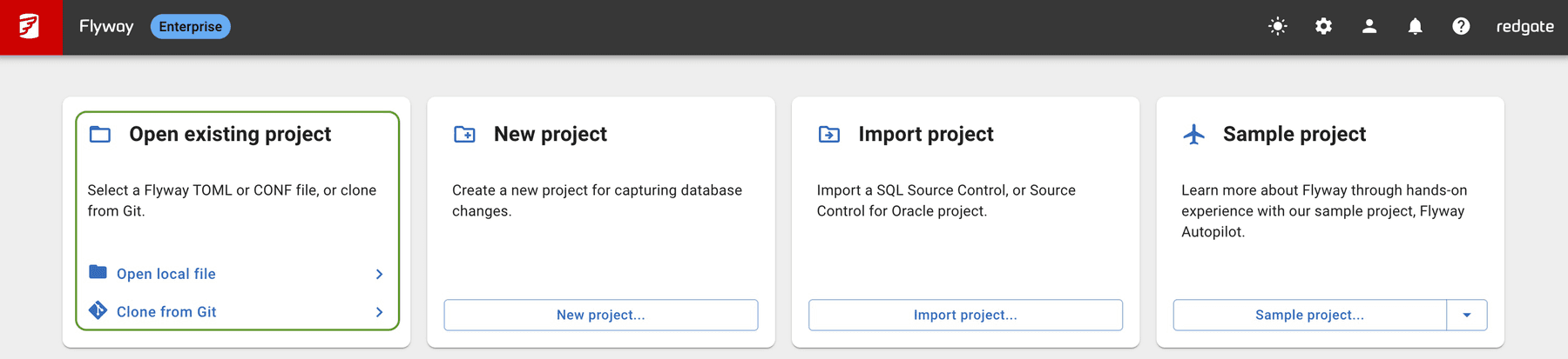
- Before
- The split button hides Git access in a dropdown. “Open from version control” is unclear language.
- After
- “Open local file” and “Clone from Git” are both visible at a glance, with unambiguous labels.
Approach
Smallest viable change first
A full redesign of the launch page was discussed. We chose not to pursue it. A larger change would have introduced too many variables, making it impossible to attribute any outcome to a specific decision. The smallest viable intervention kept the signal clean.
Identify from telemetry
Drop-off data flagged the launch page. We set the 20.7% abandonment rate as our baseline for new hybrid Enterprise projects.
Form a hypothesis
The hidden split button and vague “version control” label pointed to a discoverability failure, not a deeper architectural UX problem.
Design the minimal fix
Two explicit buttons. One label change. No full-page redesign, so results could be attributed with confidence.
Ship and monitor
Released in v8.3.6 on 23 July 2025. The funnel metric was tracked consistently from that release forward.
Impact
A clearer path, measurably fewer exits
−4.6pp
Launch page drop-off fell from 20.7% to 16.1% for hybrid Enterprise projects — tracked consistently across multiple versions since v8.3.6 shipped in July 2025.
What the number means
For every 100 people starting a new project, roughly 5 more now make it through the launch page. At scale, that’s a meaningful reduction in early attrition before people reach Flyway’s core value.
Why the change worked
“Clone from Git” is unambiguous in a way “Open from version control” is not. Clarity of language did as much work as the layout change, and the two effects are inseparable.
Reflection
What this taught me
Telemetry tells you where, not why
Moving from metric to mechanism is where design adds value in a data-driven team. The data showed the drop-off; understanding the root cause took design judgement and a hypothesis.
Language is part of the design
One extra word, “existing”, removed an ambiguity that was likely sending people in the wrong direction. Copy decisions deserve the same rigour as layout choices. They’re not separate disciplines.
Start small, then escalate
A minimal change isolated the variable and produced credible evidence. It also built the case for the next intervention, the Schema Model wizard, which delivered an even larger improvement.